The Project:
Wilde First Aid Training is dedicated to delivering expert first aid instruction, offering courses and lectures that range from basic life-saving techniques to advanced emergency response training. Led by Lee, the company provides hands-on, practical education designed to equip individuals and professionals with the confidence and skills to act in critical situations.
The brand identity needed to reflect both the reliability and expertise of the training, while also capturing a personal and symbolic element, integrating a kestrel into the design. The kestrel, representing speed, precision, and resilience, was a meaningful choice for Lee’s brand, emphasising the importance of quick thinking and strength in emergency situations. Developing a logo that balanced these elements while ensuring versatility across various platforms was a key focus.
The Rationale:
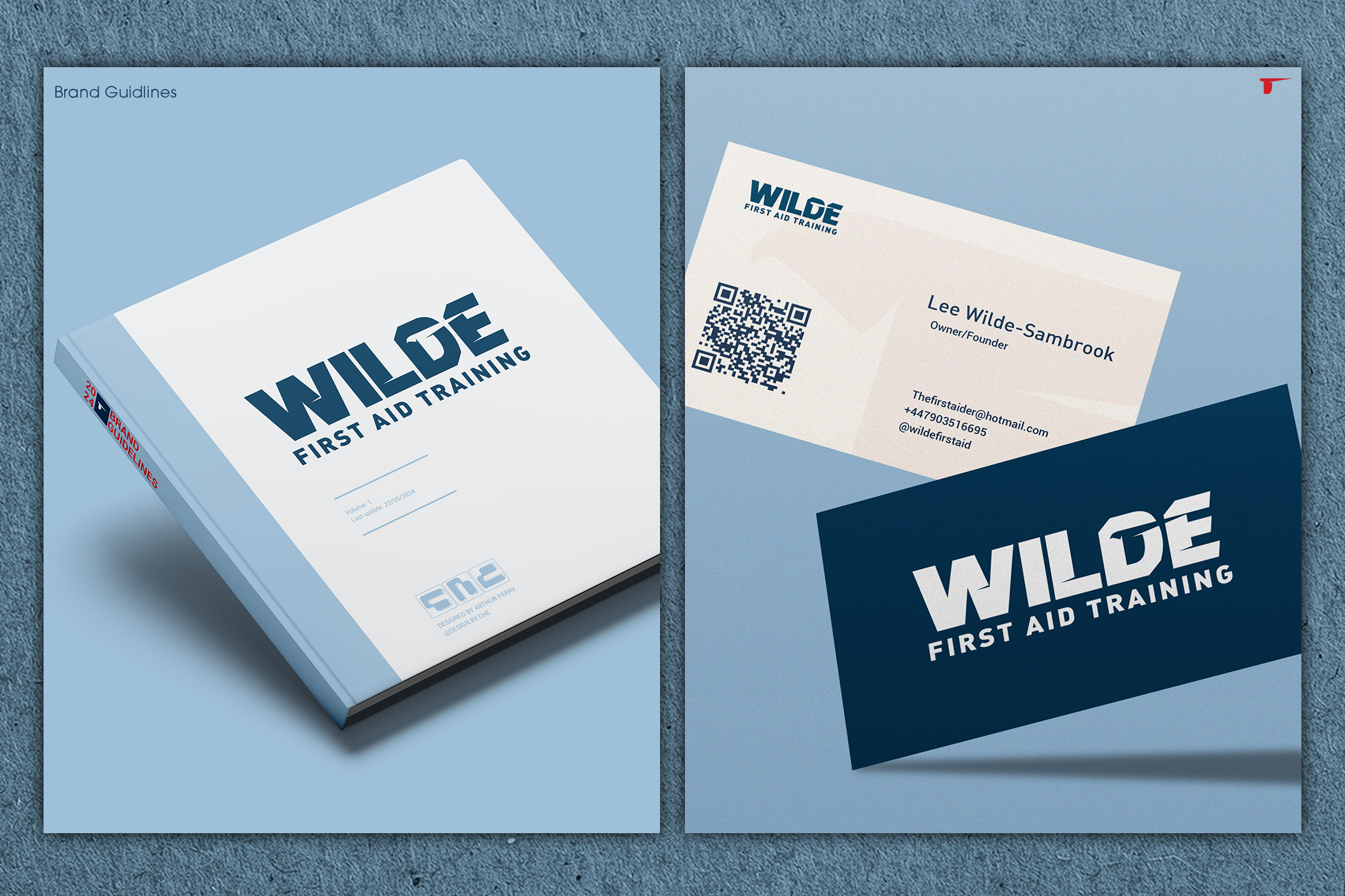
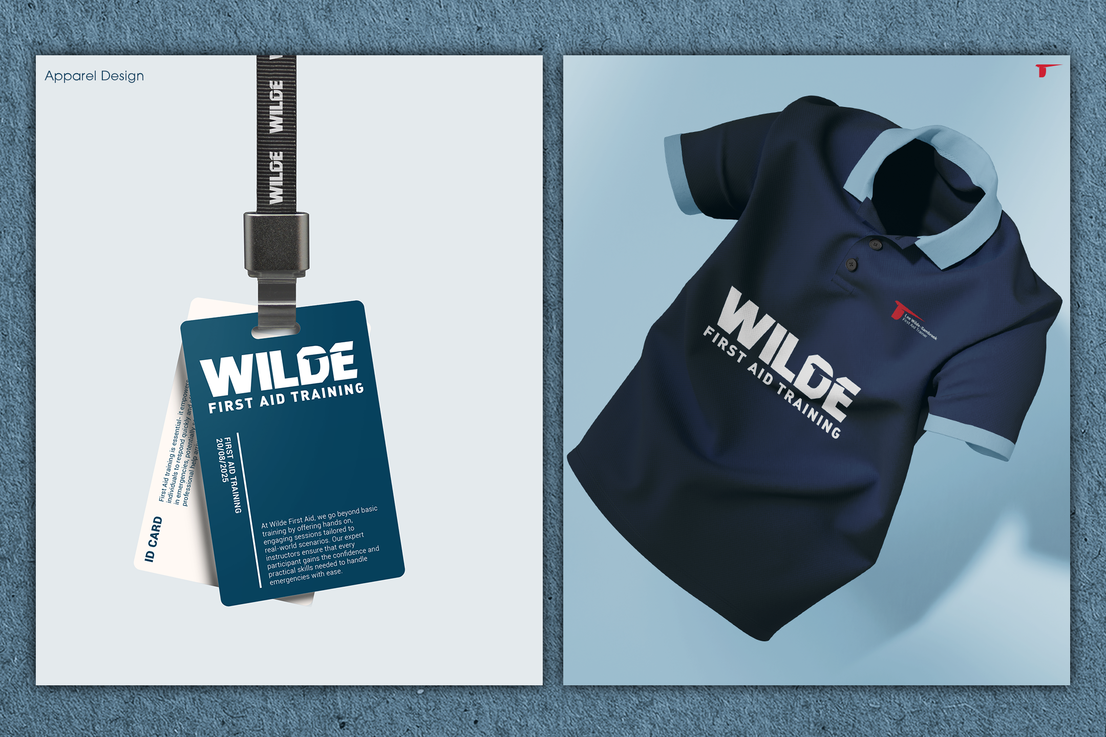
The Wilde First Aid Training logo is built around a responsive design system, ensuring adaptability across different applications, from course materials and signage to digital platforms. The kestrel icon was carefully crafted to symbolise agility and focus, seamlessly integrated into the typography to create a dynamic yet professional mark.
To move away from the traditional “emergency” colour palette often associated with first aid, the chosen hues are calm, secure, and reassuring, reinforcing a sense of trust and stability rather than urgency. The use of negative space within the letter "D" adds a distinctive touch, creating a clever and recognisable brand mark that retains clarity at all sizes.
With a brand identity that conveys expertise, preparedness, and personal meaning, Wilde First Aid Training stands out as a trusted source of first aid education, designed to instil confidence in every learner while reflecting the precision and dedication at the heart of the company.